In 2002/2003 I spent a stretch in a studio in Angel, London, run by Neville Brody (celebrated English graphic designer known for transforming digital design), watching big brands take their first nervous steps online. Bandwidth was scarce, browsers disagreed with each other and there were about five fonts you could rely on. The lesson from that time was that constraint is a discipline; strip a design to what carries meaning, and the brand survives. Twenty-odd years on, the constraint has changed but the lesson hasn't.
Ask many businesses where their brand lives and they'll point to the guidelines: colours, type, tone of voice, maybe a few pages on personality. Ask where customers actually meet the brand, and the answer is the website at 9pm on a phone, a form, a login, an error message. And that’s where a lot of good brand work has a gap.
The new website gets briefed and the brand arrives as nothing more than a PDF attached to an email. What comes out the other end is usually on-palette but off-brand. The logo and fonts might be right, but the experience is the same as every other site built on the same template.
Plato Design Director, Ryan wrote last year about why looking premium isn't enough and how a brand behaves matters as much as how it looks. Digital is where that theory gets tested hardest, because it's the one channel where a brand has to act. An ad can claim anything. A website has to behave, and the brand is whatever happens in the first eight seconds after a user lands there.
Four signs your brand hasn't reached your website
- The brand is just a bunch of adjectives. ‘Helpful’, ‘bold’ and ‘trusted’ – words like this appear in many brand guidelines. But almost none describe how those brand personality traits come into play when a form fails, a page takes four seconds to load, or someone types the wrong password twice. Brand behaviours need to be clearly defined or a developer can't build it and a tester can't check it.
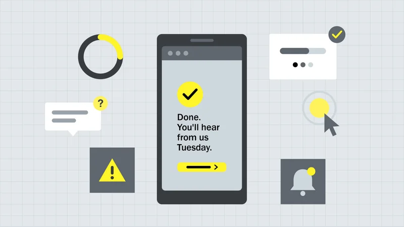
- The unglamorous moments were never designed. The things we want the user to experience always get design reviews, such as the hero images and font use. Often overlooked are the things we don’t intend the user to see or experience, such as error messages; they get whatever the framework ships with. Yet errors, empty states, confirmations, loading and the login are where people pay the most attention, because something has gone wrong or something matters. These are the moments people remember and repeat to others. They’re an opportunity for the brand to act.
- Speed and accessibility are just for compliance. A slow site tells people their time is worth less than your carousel. An inaccessible one tells a fifth of the population they weren't considered. Both should be brand decisions, yet they often get handed to developers as technical tickets.
- Brand and build never met. When brand and digital are separated, the decisions that shape the experience get made by whoever picks the component library. Button behaviour, form patterns, motion, microcopy can all be left to default.
What changes when you treat brand as behaviour?
The brand personality gets translated into specifications. ‘Helpful’ could mean the form remembers what you entered. ‘Trusted’ means users can see what happens to their data before being asked for it. ‘Bold’ might be a homepage that takes a position instead of hedging with six equal tiles. Once defined, brand, UX and development align.
Brody's rule was to reduce noise to amplify meaning. Whether it’s twelve unnecessary fields to fill out on a form, or a default error apology, every moment you leave undesigned adds noise the brand didn't choose.
The moments that matter get designed on purpose. For example, a confirmation screen that reassures or an empty search result that offers a way forward. These small interactions matter commercially too. A useful error message helps someone finish an enquiry. A clear confirmation can save a follow-up call. A simpler form removes reasons to abandon it. This is where brand behaviour supports conversion and customer service, as well as trust.
Performance and accessibility move onto the brand scorecard. Core Web Vitals, WCAG conformance and task completion sit alongside brand tracking, so success is measured by how well the site works for customers and the business. The brand promise and the technical scorecard are aligned.
Some brands are seasonal. If the brand changes with the calendar, the website should too, and that's a behaviour you can specify.
Brand strategist, and UX and technical leads collaborate closely from workshop to launch. The brand informs the interaction design, the technical constraints feed back into the brand, and nobody has to reverse-engineer intent from a PDF. Brody's designs were avant-garde and never without purpose; the experiment always lived inside a structure. In digital the design system is the structure. Behaviour is where the experiment goes, and it's the part most teams never reach because the structure was handed to them finished.
Case in point: ChristchurchNZ
ChristchurchNZ has one of the harder brand jobs in the country. As the city's economic development agency it has to make the city of Ōtautahi Christchurch appeal to just about anyone - a weekend visitor, a family on the move, students, businesses, and event organisers. In 2019 it had pulled 15 separate websites into one. By 2024 a new city brand had arrived, and the brief asked for a site that would be "the official digital shop front for the city" while still showing the work ChristchurchNZ does as an organisation. One brand, one website, multiple audiences.
The city’s brand promise has to be true and relevant for all of them, so before design started the work went into what the site would do for each. ChristchurchNZ brought audience profiles by stakeholder type and an information architecture built around them. We brought the behaviours: content organised editorially rather than by department, personalisation and geo-targeting so a visitor and a local see different things, integration with the CRM and event platforms so the site knows what's on, and search that could take a question like "I have a conference in May, what's on, where can I stay and what venue suits 80 people" and answer it. None of that is a visual decision. All of it is brand.
What’s different is that the brand isn’t something ChristchurchNZ just describes, it’s something the site actually does. These 3 behaviours carry most of the weight on the live site:
- The site changes with the city. Ōtautahi Christchurch in spring is a different place in July, and the site knows it. The ‘Visit’ section talks about timing and weather, and the events and experiences move with the season. Most sites are built once and left to age. This one behaves the way the city does.
- The site meets you where you are. ‘Visit’, ‘Live’, ‘Business’ and ‘Meet’ are four front doors, each organised around the questions that audience actually asks. A visitor never wades through business programmes to find a hot pool, and 15 sites' worth of content sits behind one structure without anyone noticing the seams.
- The site does some of the work for you. The ‘Made For You’ itinerary builder takes a few preferences and returns a personalised plan for enjoying the city. It's the brand promise turned into a feature, and it was possible because the site was built to keep gaining behaviours rather than be finished.
What about a brand’s visual identity?
It still matters, and it's where most of the effort already goes. Type, colour and layout are the fastest way for someone to recognise you, so our brand work starts there. The point we’re making here is about what happens after recognition. Visual identity earns a person's attention; behaviour decides whether they trust you.
Neville Brody taught me that type was never about the font. It was a language for the brand's essence, built from legibility, hierarchy and rhythm. Behaviour is the same kind of language, built from what the site does when a user hesitates, gets it wrong or needs something at 9pm on a tiny mobile screen.
There's another reason it matters so much now. As Conor covered in July, more people are meeting brands through an AI summary than a homepage. The visual layer is often stripped away before anyone even gets to see you. What survives is how the thing works when they do.
6 quick wins to do next
If your brand guidelines describe how the site should look but say nothing about how it acts, the brand hasn't reached digital yet, whatever the launch deck says. But it’s not hard to course correct:
- Instead of asking "Does the site match the brand guidelines?" Try, "If a customer only ever met us through the website, what would they say we're like?"
- Write what each brand personality word means as an action for the ‘forgotten’ elements of your website, such as a form, a 404 error, a loading wait or a confirmation message;
- Break your own site on purpose and read what comes back to customers;
- Rewrite your ten most-seen system messages in the brand's voice;
- Put speed and accessibility numbers on your brand scorecard;
- Get the brand lead and technical lead together before the next brief goes out.
That studio back in Angel in the early 2000s had five fonts and no bandwidth, yet the brands that came out of it were still unmistakable. Yours has every tool going for it, you just have to make sure it behaves like your brand.