- Client
- Environment Canterbury
- Industries
-
- Public sector
- Transport
- Sector
The Metro bus livery is one of our most thoroughly researched and evidence-backed projects. It is also one of our most collaborative efforts with input, feedback and approvals provided by multiple stakeholder groups, including Environment Canterbury, Christchurch City Council, Selwyn District Council, Waimakariri District Council and Matapopore.
Since 2011, Ōtautahi Christchurch’s regenerated city has cultural narratives proudly designed into the built environment to express our unique sense of place to locals and visitors alike. With hundreds of buses on the roads, we considered them such a prominent part of the urban landscape the livery warranted similar treatment. The opportunity arose with a routine change in bus operator contracts. With goals around increased patronage on public transport, Environment Canterbury asked us to explore how a new livery for Christchurch’s buses could help achieve this.
Central to the challenge was that parts of the Metro network had developed in isolation to solve specific challenges over time. This had created a network that, when viewed as a whole, did not present as one connected service. Research conducted by both third parties and ourselves indicated users had learned to cope in this busy communication system, but general understanding of the Metro network and how it worked was very low.
“Promise an experience to your audience and deliver it.” This was our advice to Metro and the approach that underpinned our process. To increase patronage on buses, we needed to make it easy for people to understand the scale and connectedness of the network and give them confidence in what the experience of using that network would be. To find the right way of doing this we reviewed the Metro brand and experience, testing and challenging the various claims made to users, and exploring how the livery could convey priority information. Ultimately it was decided that a move to a united livery across all buses promoted the opportunity to tell a concise story of a cohesive network in a way that could influence behaviour. Through the initial planning and design thinking phase we redeveloped Metro’s brand proposition to ‘our region, connected by our network’. This informed the cultural narrative, which influenced storytelling and visuals to create an aesthetic all can identify with.
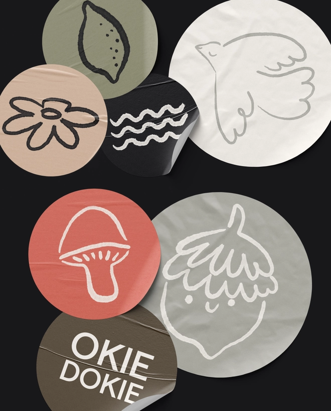
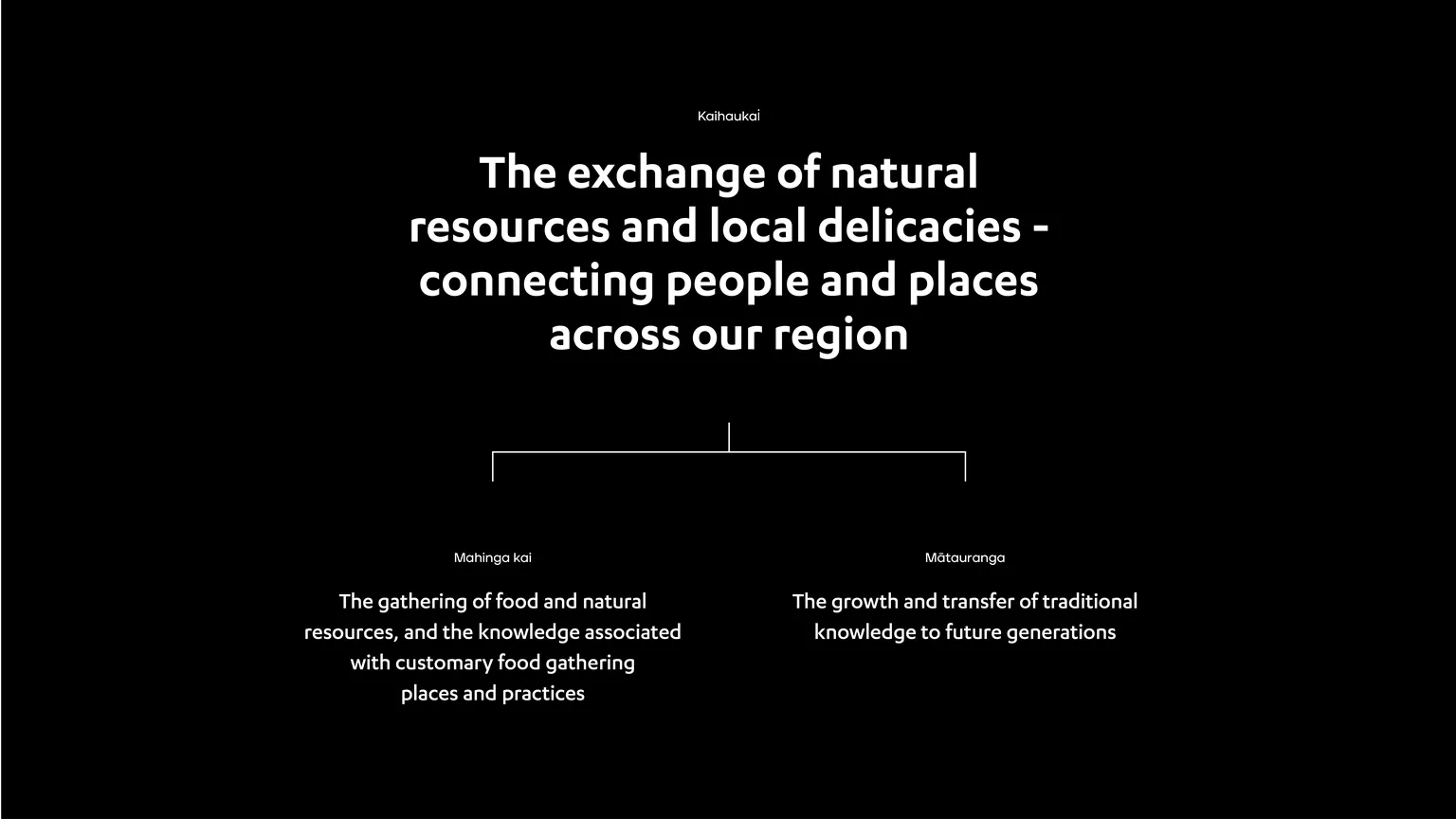
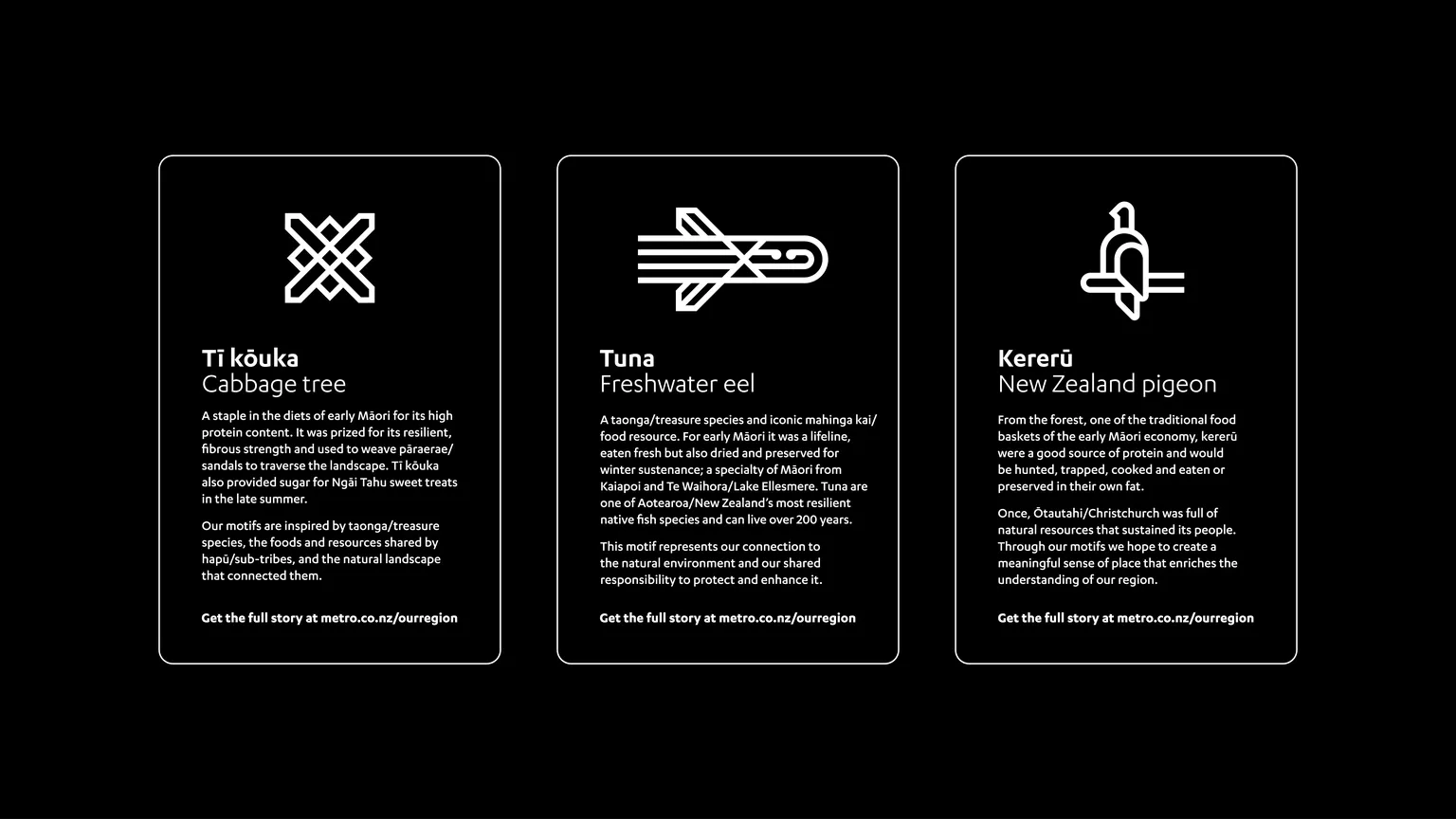
The aligning cultural narrative developed by Matapopore (the organisation responsible for realising Ngāi Tūāhuriri/Ngāi Tahu values, aspirations and narratives in design) revolves around kaihaukai, a system that once connected Ōtautahi hāpu through travel, trade and sharing of mahinga kai (food resources) and mātauranga, the transfer of ecological knowledge to future generations. Today, in our urban environment, Metro provides that vital connection between people and their region. Weaving the fundamentals of kaihaukai into the design, the livery features motifs inspired by taonga species, mahinga kai shared by hapū, and the natural landscape that connected them.
The large connected device tells the big picture story, while motifs are individualised for storytelling that can be further explored on the website and in the central bus exchange. Our intention is to encourage users to view their modern surroundings differently; to understand what the natural environment is now and what people once depended on for survival.
The new Metro livery exemplifies brand melding with authentic cultural elements. For brand equity, the linear style of the ‘our connected region’ device is sympathetic to Metro’s existing brand. Colours also represent the Metro narrative to strengthen the ‘connected’ story. The green of the city’s loop route represents land; the new teal symbolises water. Safety and longevity were other key considerations when selecting paint and vinyl, and were finalised after valuable consultation with operators and their suppliers. All combined, the new Metro livery creates a meaningful sense of place and connection that enriches one’s understanding of where they live. We like to interpret it as a modern-day representation of mātauranga – passing on of our region’s story to future generations.
This project is featured in Kātoitoi - Aotearoa’s annual collection of design.





Contact us
Get in touch on how we can help you accelerate your growth.


