WORK
From deep discovery to a brand vision built on Shine

Our journey with Woodford House began with a trip to Hawke’s Bay to immerse ourselves in their exquisite grounds and culture of confidence and achievement. Following deep research and discovery sessions with their school community, we collaborated on a brand strategy.
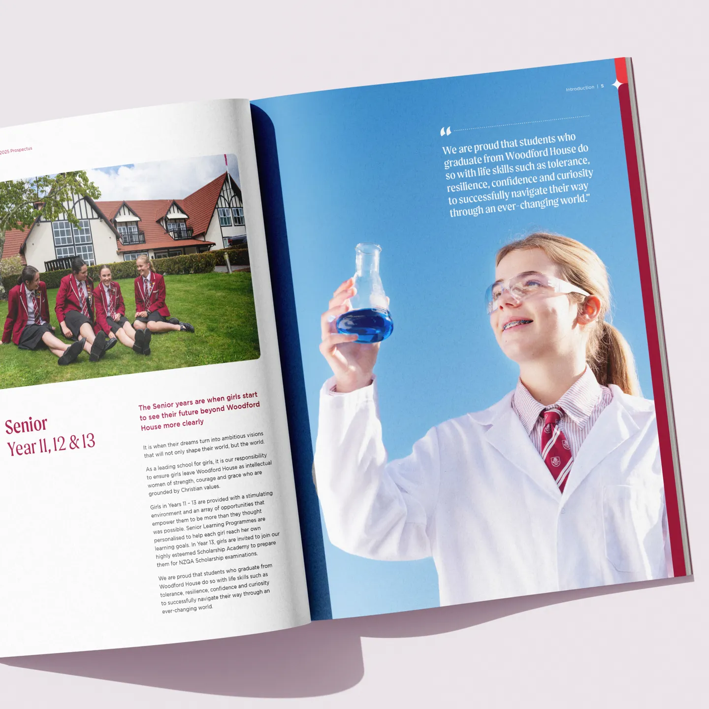
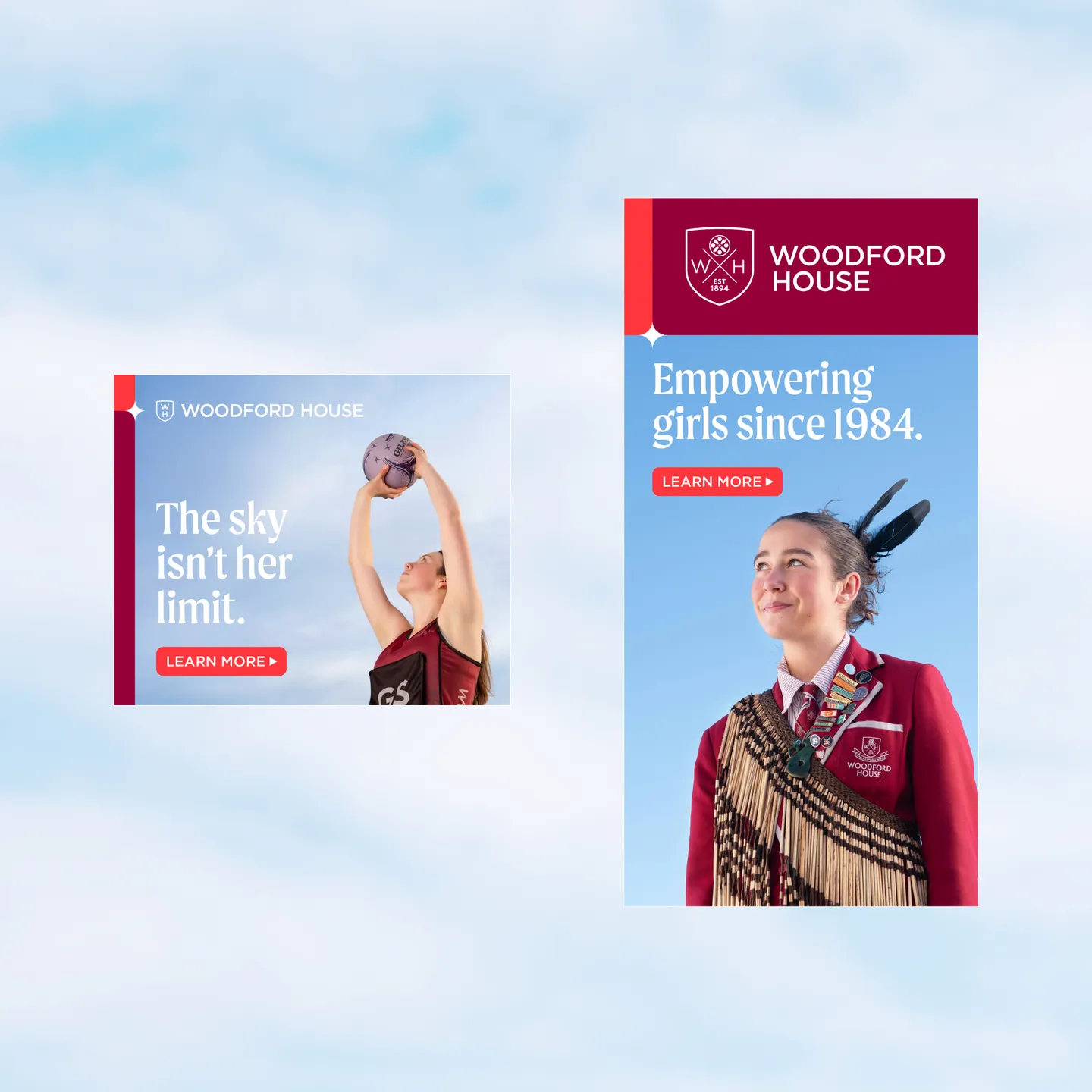
Woodford House is one of New Zealand’s largest boarding schools for girls, and they have an impeccable NCEA results record. But what sets this school apart from any other is ‘Shine’, their unique mentoring programme that guides girls on a journey of self-discovery and helps prepare them to successfully pursue their chosen future. Key elements of Shine range from hands-on workshops with inspiring speaker mentors, to immersive camps, and a wide range of personal development initiatives. It’s quite remarkable, so it helped form a large part of their new brand strategy.
To visualise Woodford House as the place ‘where girls shine brighter’, we’ve evolved their existing brand by strengthening the logo, adding secondary colours and a character font, and creating a graphic device derived from the idea of a guiding light and shapes already within the logo. This star motif influences layouts, acting as a divider to provide structure with flexibility; it can also be replicated to become a pattern.


Contact us
Get in touch on how we can help you accelerate your growth.