WORK
New Zealand's largest and longest established seed company
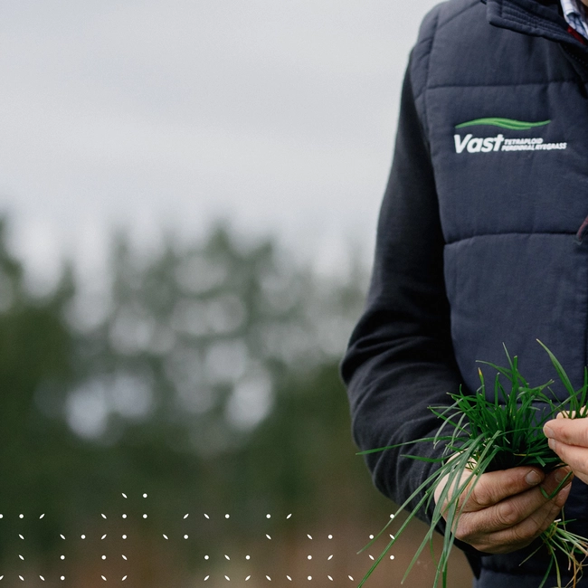
PGG Wrightson Seeds holds the enviable position of being New Zealand’s largest seed producer and supplier. We’ve worked with the PGG Wrightson Seeds team for many years to create a solid market position as industry leaders. We’ve delivered sales campaigns; a knowledge hub website; branding and content for apps; product collateral and social media management.
When we began, the market perceived PGG Wrightson Seeds as more of a general retailer when they are actually innovative specialists. So we’ve helped them craft a strong brand story and value proposition to proudly own their position in the market as New Zealand’s largest and oldest seed company; as well as build value in their specialist technical advice, plant solutions, and innovation, R&D and trademarked technology. This is reflected in the hero statement ‘Seed is just the start’. Not only does this have literal meaning - seeds are the start of the growth process, which goes on to feed stock, people, etc. But on a larger scale, it declares that PGG Wrightson Seeds have much more to offer than seed alone - innovation, experience, advice, resources and tools.
To prove this and help PGG Wrightson Seeds take the lead on education and technical advisory for seeds and farming outcomes, we collaborated on the creation of an online Knowledge Base and seasonal and crop/pasture related guides. We also partner with their team on a comprehensive social media plan. Monthly topics range from simple, fun engagement to seasonal to-do lists and helpful hints on pests and diseases or how to achieve optimal growth.
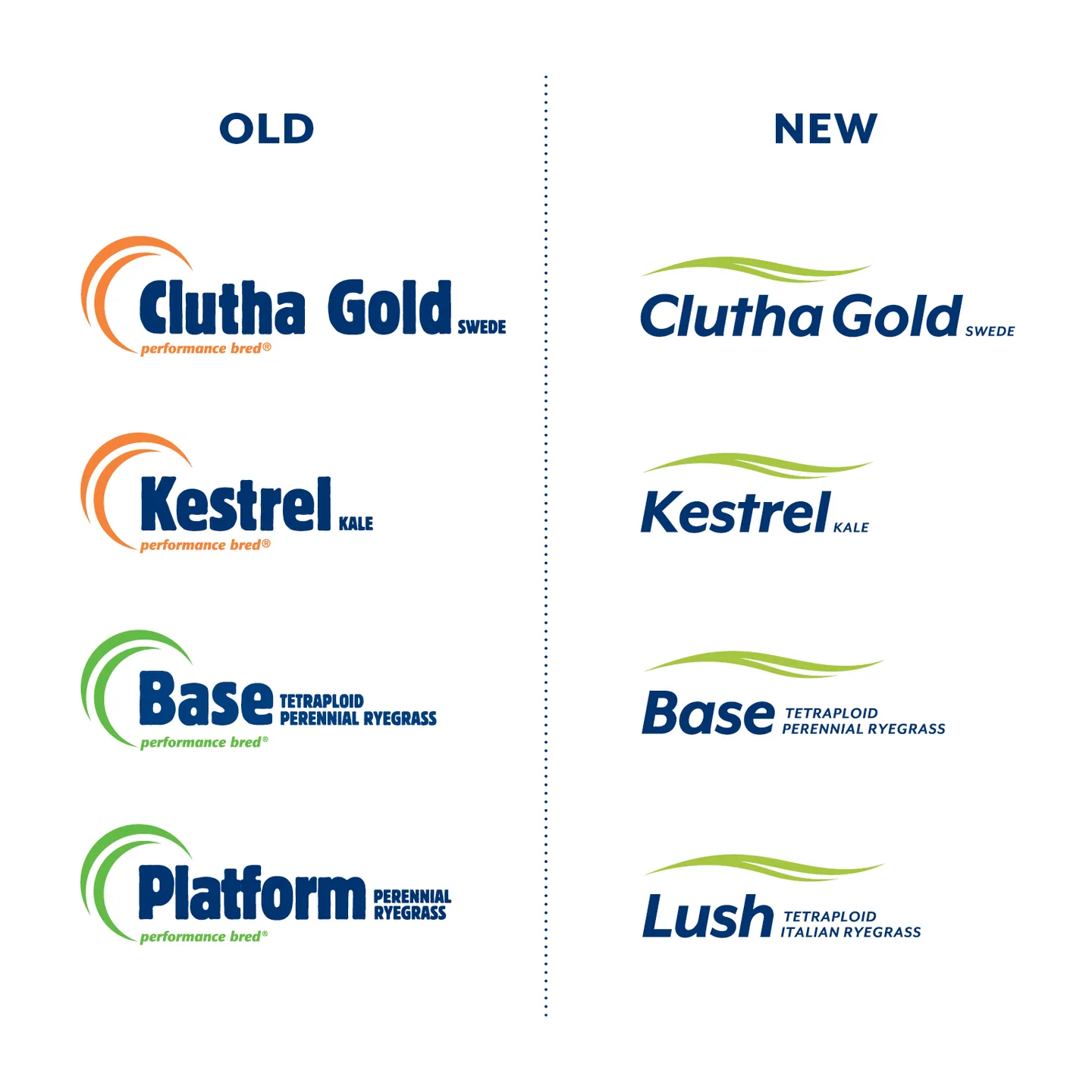
Other updates include the product brand logos. The master brand logo has a lot of recognition, history and goodwill in the market. But the various product brands within the brand architecture had their own identities that did not show a clear connection. Over time we’ve evolved these to have a stronger connection to the master brand. Using the hill swoosh device atop the wordmarks makes them recognisable as a PGG Wrightson Seeds product.
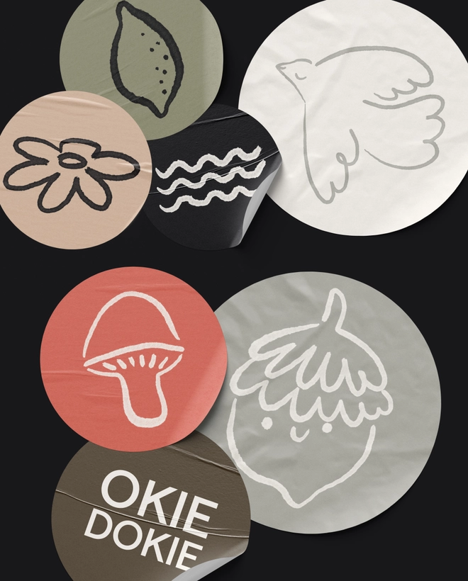
Further additions to the brand include bespoke illustrations, a seed-inspired pattern and point device to create a flexible yet cohesive suite of assets that can be used across any medium or communication. A change in typography creates a more conversational tone of voice. And there were also a vast array of colours used to differentiate products. We proposed simplifying from 13 and counting to just 5, with a focus on greens and blues to be more unified with the master brand.


Contact us
Get in touch on how we can help you accelerate your growth.