WORK
Understanding the link between language, culture and identity

Working with Ko Taku Reo - a new national education service provider for all New Zealand’s Deaf and hard of hearing children, we had the chance to reassess some elementary thinking about the fundamentals of communication to create a brand built on an understanding of the importance of language, culture and identity and the principles of accessibility.
Brand identity
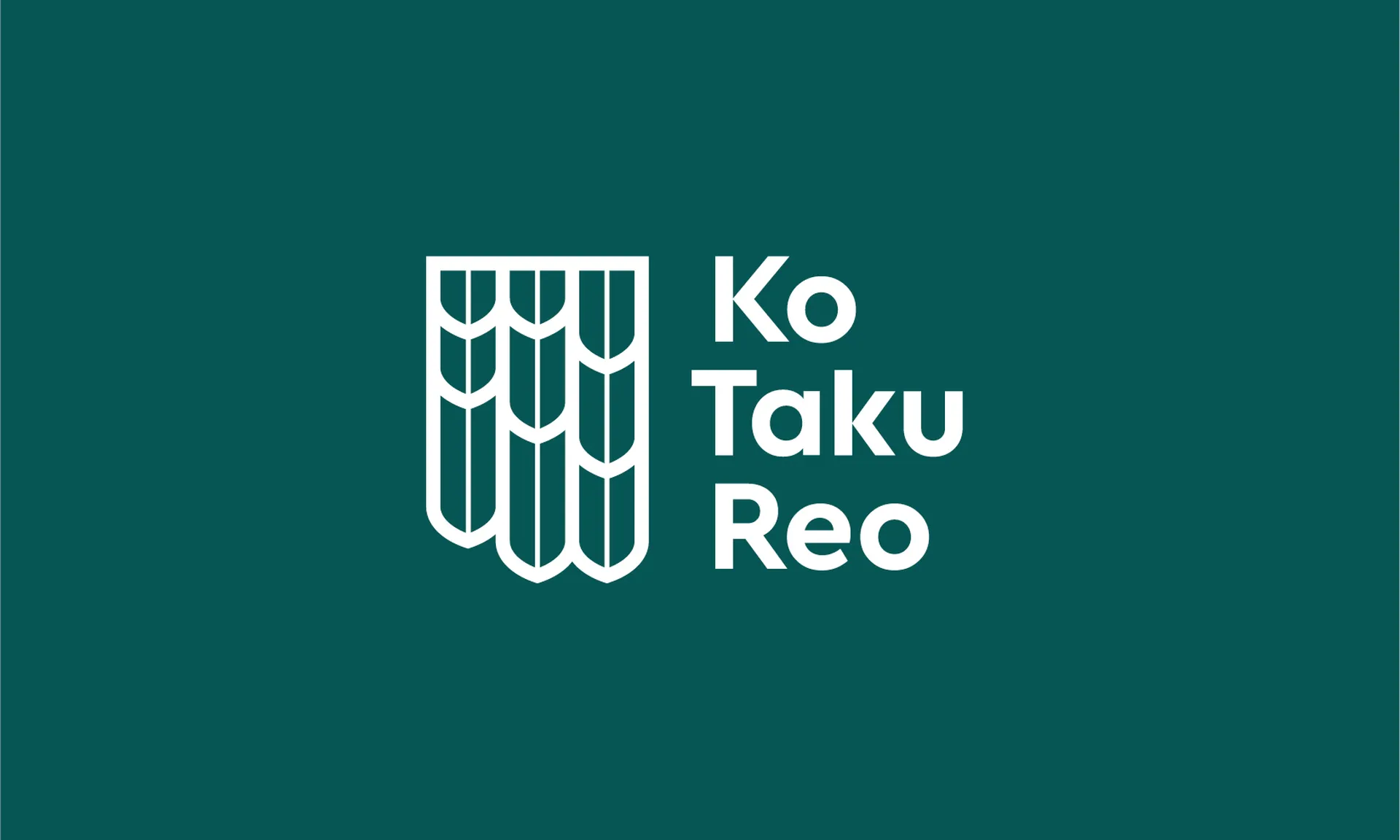
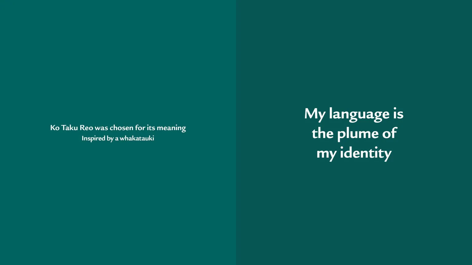
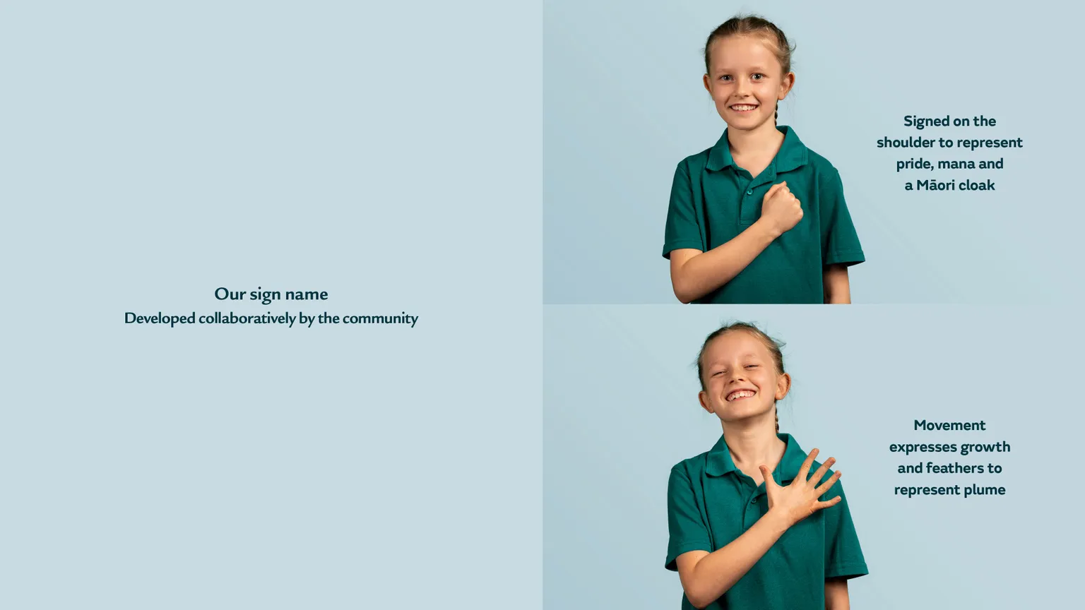
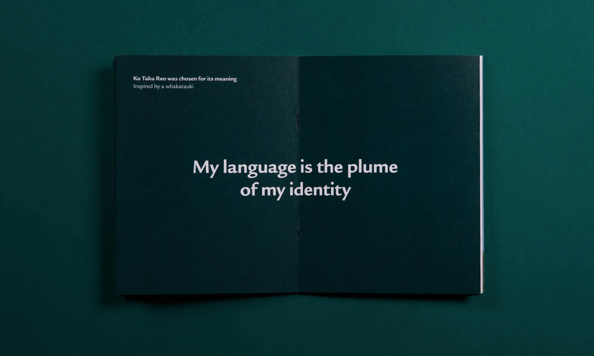
Working with an advisor of te reo Māori to name the organisation, Ko Taku Reo was chosen for its meaning “My language is the plume of my identity.” This then informed the development of the school’s sign language name, which in turn helped us design a strong visual identity. Inspiration has been found in the form and colours of native bird feathers and the mana of a cloak. A kowhaiwhai pattern has also been recreated for Ko Taku Reo.
The logo takes cues from the cloak to be a representation of plumage and a simple yet unique identifier that is contemporary and stands tall with pride.
Throughout all aspects of the visual identity and subsequent website development process, we applied accessibility best practice across typography, tested the colour mix for colour vision deficiency appropriateness and chose apparel to best suit any skin tone, which is necessary for seeing sign language and reading lips and faces.
Video and photography
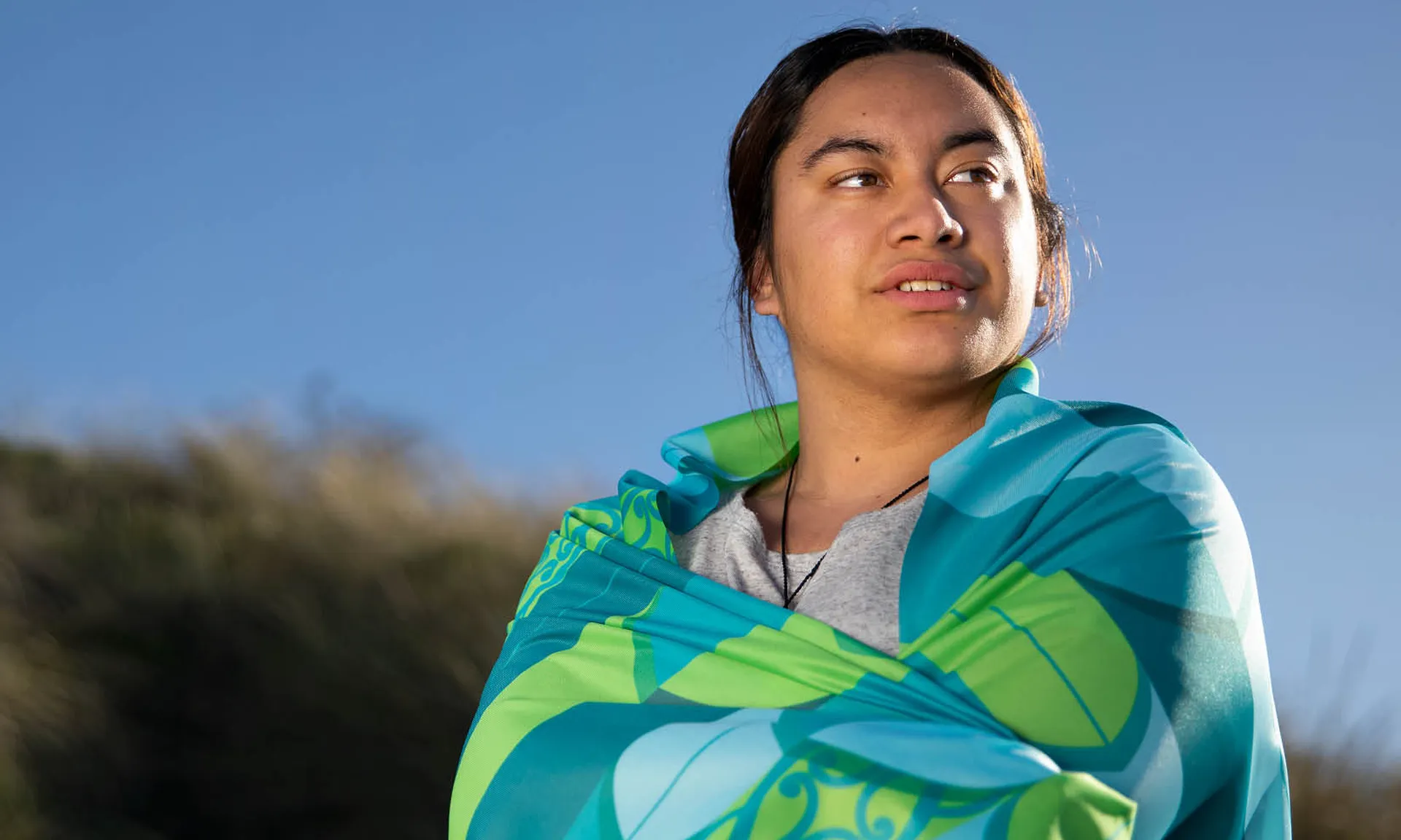
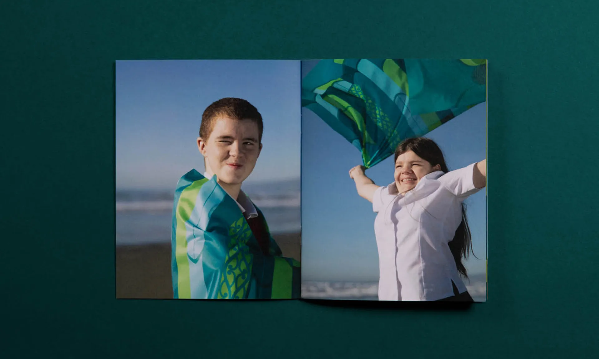
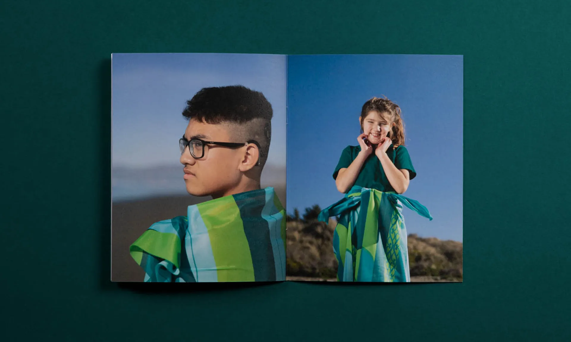
To give the brand warmth and authenticity we spent time with some of Ko Taku Reo’s Christchurch-based students and staff to capture their personalities and learning journey in images and video that could be used on the website. To have them interact with the brand, the fabric wrap featuring Ko Taku Reo’s plumage was created as a symbol of identity to be used in whatever way each subject chose.


Contact us
Get in touch on how we can help you accelerate your growth.